[restrict]

Particles

Particles are incredibly simple building blocks that Gantry 5 themes thrive on. They are easy to set up, require no coding experience to configure, and are built on an intuitive and human-readable Twig and YAML file structure that makes developing them a breeze. You can use particles to set up your logo, display content in a way that complements the theme design, and more.

OwlCarousel

The Owl Carousel particle is a simple and elegant particle, based on the open source project of the same name by Bartosz Wojciechowski, that displays featured information in a modern slider.

Particle Configuration

Option Description
CSS Classes Sets the CSS class for the content of the particle.
Title Sets the title of the particle, as it will appear on the front end.
Prev Next Enables a previous / next switcher on the front end.
Dots Enables or disables pagination dots.
Autoplay Enables or disables autoplay, allowing the particle to automatically move through items.
Autoplay Speed Sets the speed at which items are automatically progressed in autoplay.
Image Overlay Enables or disables the use of image overlay in the particle.

Item Configuration

Option Description
Image Enter the path to the image file you wish to use for this item.
Title Enter a title for the item here.
Description Enter a description for the item here.
Link Enter a link for the item here.
Link Text Enter a the text you want to appear as the link for the item here.
Button Class You can enter a button class you wish to use for the link button here.

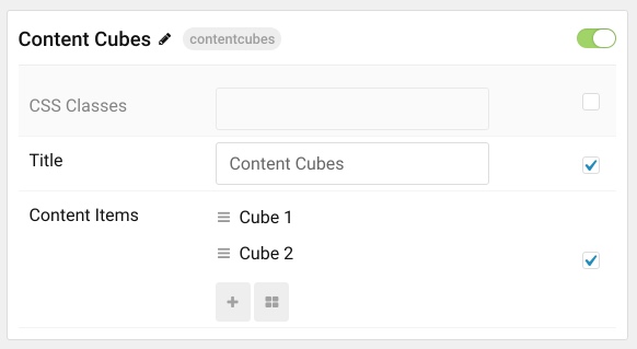
The Content Cubes particle is a great way to highlight some of your best content in a way that perfectly complements the theme's design. This is a natural, and aesthetically-pleasing way to ensure that your featured content stands out.

Particle Configuration

Option Description
CSS Classes Sets the CSS class for the content of the particle.
Title Sets the title of the particle, as it will appear on the front end.

Item Configuration

Option Description
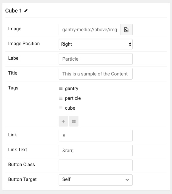
Image Enter the path to the image file you wish to use for this item.
Image Position Set whether the image will appear to the left or the right of the text in the item.
Label Enter a label that appears on the top of the title of the item.
Title Enter a title for the item. This appears on the front end.
Link Enter a link that you would like the item to take visitors to when selected.
Link Text Enter any text you would like to have appear as the link.
Button Class Set a class that will apply to the link's button for this item in the particle.
Button Target Set the way you would like the link to open. You can choose between Self and New Window.

Item Tags Configuration

Option Description
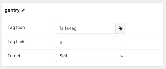
Tag Name The name of the tag becomes the tag's name on the front end.
Tag Icon Select a Font Awesome icon you would like to appear alongside the tag's name on the front end.
Tag Link You can set a specific link that clicking on the tag will take the visitor to, here.

Content Tabs

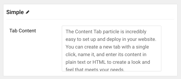
  • The Content Tab particle is incredibly easy to set up and deploy in your website. You can create a new tab with a single click, name it, and enter its content in plain text or HTML to create a look and feel that meets your needs.
  • The Content Tabs particle makes it possible to pack a lot of content into a small space, without sacrificing ease of use. Your visitors can browse between labeled tabs and explore your content without having to scroll through a wall of text.
  • Create as few or as many tabs as you need, apply custom CSS classes, and position this particle wherever you would like it to go. The Content Tabs particle looks as good on a large desktop as it does on a mobile phone.

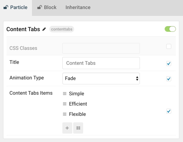
The Content Tabs particle enables you to pack a lot of useful information into a compact space that is easy to configure and intuitive to navigate.

Particle Configuration

Option Description
CSS Classes Sets the CSS class for the content of the particle.
Animation Type Sets the the animation type used when switching between tabs. You can choose between: Slide Left, Slide Right, Slide Up, Slide Down, Fade, and Toggle.

Item Configuration

Option Description
Item Name The name of the item becomes the title used for the tab on the front end.
Tab Content Enter HTML content you would like to display in your tab as its content body here.
[restrict] .. [/restrict]